Posts

24/11/20 update

Image
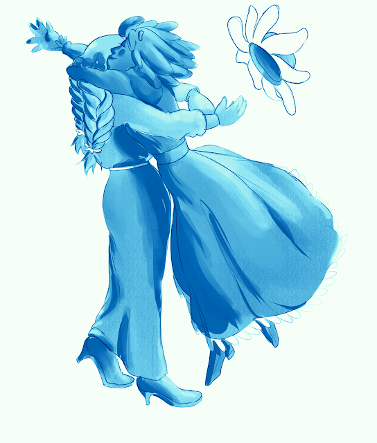
I've done a few more of the group figure drawings. Firstly, heather and clover: They both have meanings associated with luck so I continued with the gambler idea that I used before. Also, heather has a double meaning of luck and protection. So for the latter part, I gave her some muscle and chunky but friendly facial features. Secondly, zinnia and jasmine: Both have meanings to do with friendship. Specifically, jasmine means amicability and cheerfulness and zinnia means everlasting friendship. I chose to leave this one largely unfinished because I think I need to move on from these kinds of drawings. I need to work out a way for this project to push me more. I'm go back to reading and research for a bit to see if I can get any ideas. Refernces Heather pose reference Clover pose reference Jasmine pose reference Zinnia pose reference

23/11/20 update

Image
 I've done a couple drawings. I don't think that they push me forward that much but I'm a little stumped right now about my immediate next steps so it's better than not doing anything at all. First, I did a group drawing of clover, crocus and baby breath: They all mean innocence in some way so drawing them as a group felt appropriate. I was meaning for them to be sisters but it didn't really end up like that. My interpretation of daisy is different than before but I think this version fits better. I want to do more of these group shots. Secondly I did a drawing of clematis: I want to see how the Victorian style fashion fits with 60s style appliances. I think it's worked out okay but I need to do a test in colour before I'm certain. References Drawing one  reference one  and two Drawing two reference

18/11/20 update

Image
 I finished my interior concept: I'm not particularly happy with it. I think there's still stuff I could do. The door in particular isn't blending in as well as I'd like. And I should include an artificial light source to contrast the natural light from the windows. But I think I need to move on so I'm choosing to leave it here. I do like the atmosphere that I got though. References Photo packs used HIGH RESOLUTION TEXTURE PHOTO PACK Art nouveau / building pack Ireland Reference Pack Medieval Village PNG Photo Pack: People

17/11/20 update

Image
I managed to catch a cold so that halted my progress for a handful of days and then I had trouble getting back into the swing of things. I've managed to make some progress now though. I've started on an interior photobashed painting. I wasn't really sure how to to tackle it so I drew out a basic room top-down perspective room outline and tried to fit photos to it: Attempt 1 Attempt 2 I wasn't happy with these were looking. It didn't feel right. I went back to the drawing board and went researching for new photo packs and images that I could use. Eventually I decided to use an image of a room as a base and then layer on top clippings of other photos. Original photo Edited photo I also have a figure on a separate transparent layer. Separating the full edited photo into multiple worked out well last time so I'm doing it again. Figure image layer I was going to try and put in furniture but I think I just need to get this out of the way right now considering the dela...

02/11/20 update

Image
      Even though I've pivoted away from world building I still want to establish a world aesthetic.     I want to keep with the Victorian fashion but I don't want for my character to be in Victorian times. I feel like it would be limiting. I didn't want to go the steampunk route either.     I decided that I want my architecture to be Art Nouveau inspired and keep things vague when it comes to time period. Basically, I want the freedom to be able to use more modern technologies and ideas in tandem with Victorian ones if it improves the illustrations storytelling. And I think Art Nouveau has the right kind of aesthetic sensibilities that I can pull off a vague time period with.      Art Nouveau became popular in the 1890s and early 1900s. Aesthetically, typical Art Nouveau arcitecture is recognised by round edges and ornate detailing. I particularly love the work of Catalonian architect Antoni Gaudi:  Casa Batlló, Barcelona ...

28/10/20 update

Image
     I've done a small experiment.      I found a couple of pre-made poses and drew them at different angles to see how the camera angle changes how the pose is read in terms of it's personality and emotion. References Pose 1 Pose 2 - I edited the leg position but the top half is the same Pose 3

25/10/20 update

Image
    I've had some technical issues in the past week. My tablet pen broke so I needed to get a new one. Also, I was struggling a bit with what I should do next but I got an idea once my new pen came in.     Basically, what I've done is drawn a couple of my flower characters in poses with a particular emotion expressed. I then used gradient maps to change the colour palette to see how colour effects how the emotion is read. Pose 1: Clover and chamomile (Happiness/Joy) Pose 2: Asphodel (Sadness/Remorse)       My main take away from this experiment is that colour does little to effect the emotion of the image in of itself. Firstly, there's things like saturation and brightness. For example, red is typically associated with intense emotions but I can adjust how intense it feels though saturation levels. Also, I need to take into account context of the image. Colours are strongly symbolic of certain emotions but what symbolism you want is largely based on co...