Posts

Showing posts with the label research

15/03/21 update

Image
I have completed illustrations for sunflower, hyacinth and lotus. Firstly sunflower: The meanings of the sunflower are:  "Ambition; Constancy; Devotion; False appearance; False riches; Flexibility; Good luck; Haughtiness; Healing; Homage; Inspiration; Lofty thoughts; Loyalty; Nourishment; Opportunity; Power; Pride; Pure; Pure and lofty thoughts; Spiritual attainment; Strength; Unhappy love; Vitality; Warmth; Wealth." Dietz, S. Theresa. The Complete Language of Flowers (Complete Illustrated Encyclopedia) (p. 104). Wellfleet Press. Kindle Edition.  I found evidence to suggest that sunflowers can be used to clean up uranium in soil. Apparently, fields have been planted at Chernobyl and Fukushima to try and reduce the long-term impact of a nuclear meltdown on the environment. Also, sunflowers were the symbol of the Sunflower Student Movement in Taiwan since sunflowers implied positivity and hope for the future. My initial idea was to do an anti-nuclear protester and that  evo...

01/02/21 update

Image
       Before I get into my recent work, I'll just acknowledge some stuff I did before Christmas that I didn't get round to posting about. I made adaptations of two works; The Seasons by Alphonse Mucha and Jimson Weed / White Flower no.1 by Georgia O'Keefe respectively: The Seasons Alphonse Mucha (1896) Jimson Weed / White Flower no.1 Georgia O'Keefe 1936     The idea was to study the pieces and to adapt them for my project concept to try and develop my ideas further. For The Seasons, I researched into flowers that grew in each season that also matched with the personalities I associated with them. I used crocus meaning cheerfulness for spring, snapdragon meaning presumption for summer, chysanthemum meaning condolences for autumn and snowdrop meaning hope for winter.       For White Flower no.1, I was already given a flower: datura meaning deception. O'Keeffe's work has been analysed as beeing representative of female sexuality; the flor...

02/11/20 update

Image
      Even though I've pivoted away from world building I still want to establish a world aesthetic.     I want to keep with the Victorian fashion but I don't want for my character to be in Victorian times. I feel like it would be limiting. I didn't want to go the steampunk route either.     I decided that I want my architecture to be Art Nouveau inspired and keep things vague when it comes to time period. Basically, I want the freedom to be able to use more modern technologies and ideas in tandem with Victorian ones if it improves the illustrations storytelling. And I think Art Nouveau has the right kind of aesthetic sensibilities that I can pull off a vague time period with.      Art Nouveau became popular in the 1890s and early 1900s. Aesthetically, typical Art Nouveau arcitecture is recognised by round edges and ornate detailing. I particularly love the work of Catalonian architect Antoni Gaudi:  Casa Batlló, Barcelona ...

25/10/20 update

Image
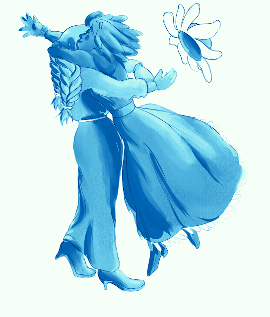
    I've had some technical issues in the past week. My tablet pen broke so I needed to get a new one. Also, I was struggling a bit with what I should do next but I got an idea once my new pen came in.     Basically, what I've done is drawn a couple of my flower characters in poses with a particular emotion expressed. I then used gradient maps to change the colour palette to see how colour effects how the emotion is read. Pose 1: Clover and chamomile (Happiness/Joy) Pose 2: Asphodel (Sadness/Remorse)       My main take away from this experiment is that colour does little to effect the emotion of the image in of itself. Firstly, there's things like saturation and brightness. For example, red is typically associated with intense emotions but I can adjust how intense it feels though saturation levels. Also, I need to take into account context of the image. Colours are strongly symbolic of certain emotions but what symbolism you want is largely based on co...

06/10/20 update

Image
I've continued on from last week's face experiment and finished it up. As I noted in an annotation, the idea for the flower petal eyelashes comes from the design for Lillia in League of Legends:          Her design is all about showing how she is one with nature. In particular, there's the flower that grows from her head and the glow from the flower is seen in her hair, back and staff. The energy from nature is quite literally flowing through her. She has also clothed herself in what looks like tree bark. I think it looks too precisely tailored to her body and armour-like to feel natural  but the idea is there. Additionally, I wish her face was more deer-like with a long nose and face. Her face feels somewhat disconnected from her body, like they just slapped on their typical League woman face and called it a day. League has a problem with the lack of face variety in their woman character designs and Lillia is little different.      Afte...