Even though I've pivoted away from world building I still want to establish a world aesthetic.
I want to keep with the Victorian fashion but I don't want for my character to be in Victorian times. I feel like it would be limiting. I didn't want to go the steampunk route either.
I decided that I want my architecture to be Art Nouveau inspired and keep things vague when it comes to time period. Basically, I want the freedom to be able to use more modern technologies and ideas in tandem with Victorian ones if it improves the illustrations storytelling. And I think Art Nouveau has the right kind of aesthetic sensibilities that I can pull off a vague time period with.
Art Nouveau became popular in the 1890s and early 1900s. Aesthetically, typical Art Nouveau arcitecture is recognised by round edges and ornate detailing. I particularly love the work of Catalonian architect Antoni Gaudi:
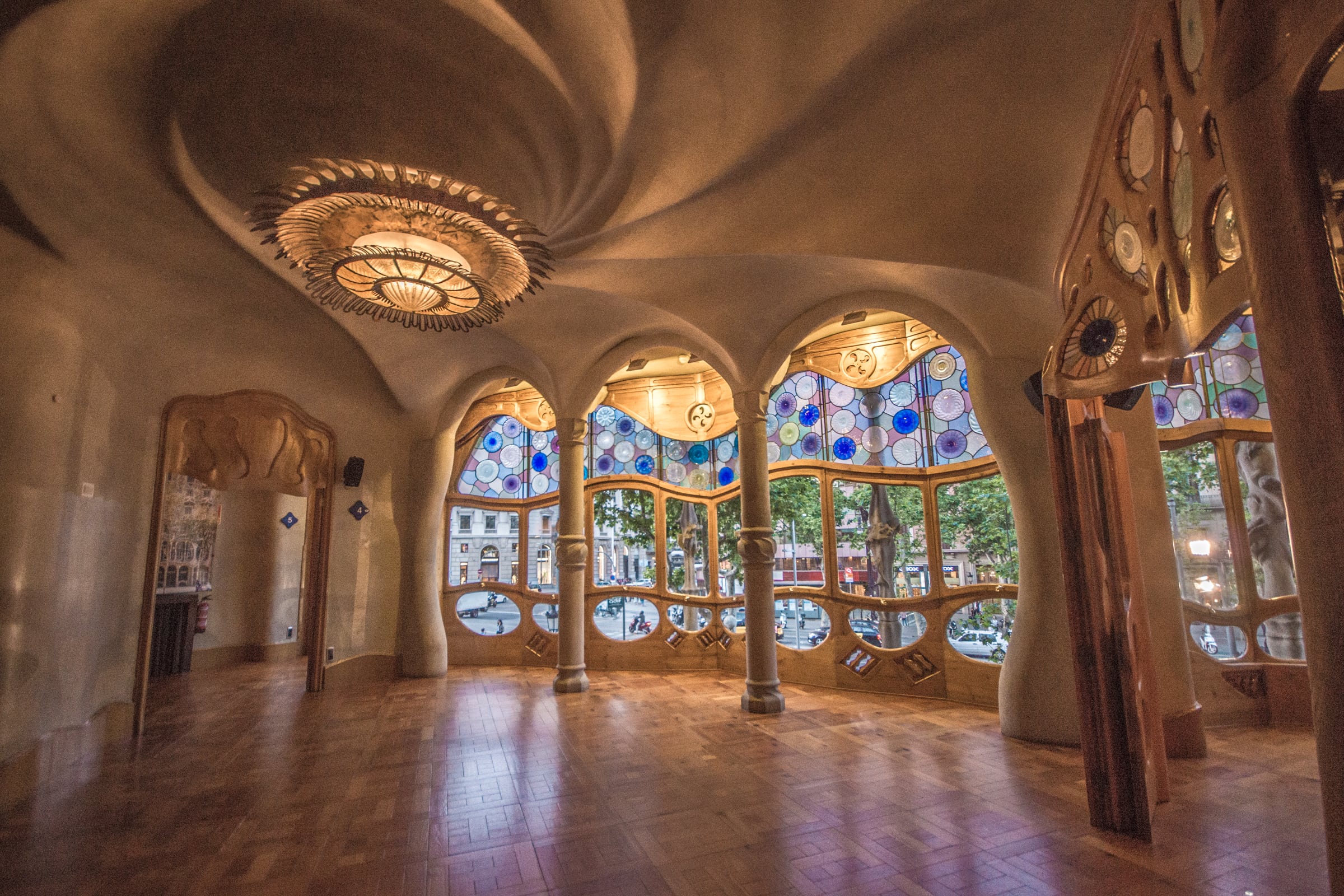 |
| Casa Batlló, Barcelona |
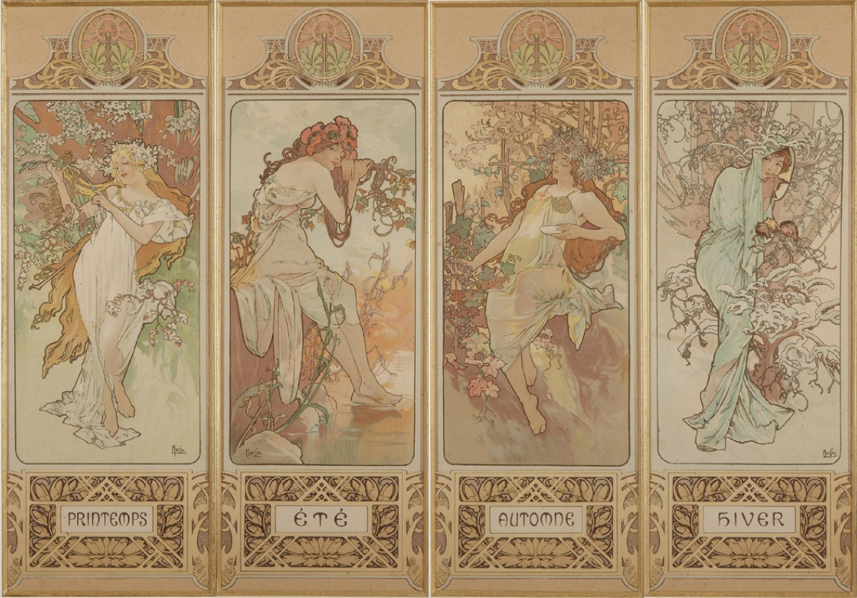
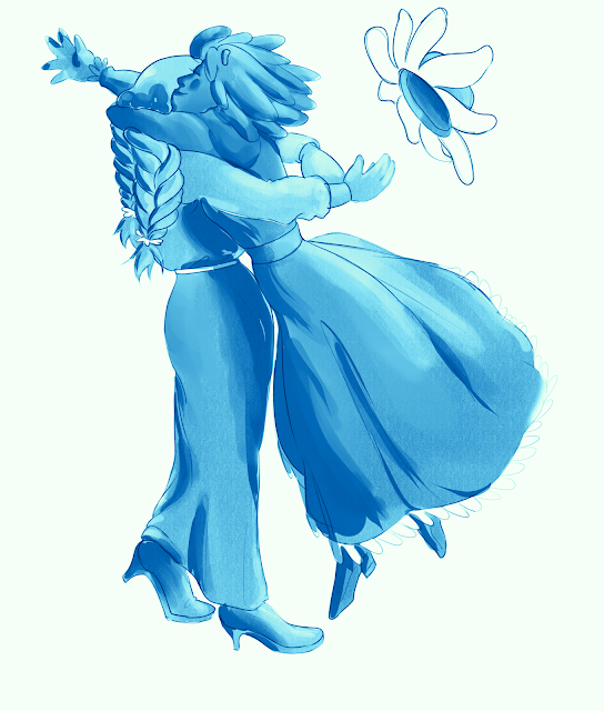
Largely, however my love of Art Nouveau comes from illustrative work. I largely associated illustrations from this movement to typically have women and/or nature as a subject matter, which ties into my project pretty well.
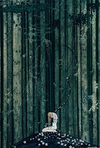
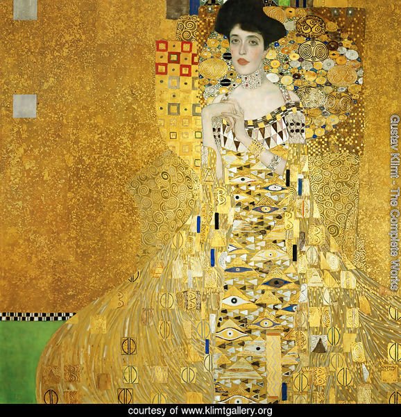
Noteworthy artists from the movement whose work I'm inspired by include:
Alphonse Mulcha
The Seasons (1896)
Kay Nielsen
In the Midst of the Gloomy Woods (1914)
Gustav Klimpt
Portrait of Adele Bloch Bauer (1907)
Rene Lalique
'Dragonfly-woman' (1897-98)
To explore this, I decided to paint an environment concept using photobashing. I hadn't done photobashing before so I thought I would be good practice. I found a tutorial on it that I followed here: https://husso.artstation.com/projects/8xgzR
So following the tutorial, I first blocked out some thumbnails
I wanted to get both nature and part of a city in my composition. I went for the lower left one and played around with stock images to get a general approximation of what I was thinking.
I mean for the green plain in the foreground to be park but with the image I chose to didn't end up going that way. I had also done some colour adjustments on the grass and skyline in particular. Also, I did this part in Krita since Clip Studio isn't built for this kind of photo manipulation and Krita seemed like a very good free alternative to Photoshop. I then separated the composition into individual images for each perspective plane. I worked in Clip Studio to paint on top the images, starting with the skyline and then the mid and fore ground.
And heres the final image:
The only major changes I made to the composition while painting were to resize one of the buildings and to remove the foreground trees. The architecture ended up looking more sci-fi than I was aiming for. I think if I hadn't used modern skyscrapers to paint over I may have ended up with something closer to what I wanted. I also think I should have made with city skyline denser or had mountains or something in the back. Otherwise, I'm really happy with how this turned out for a first go.
Resources


Comments
Post a Comment