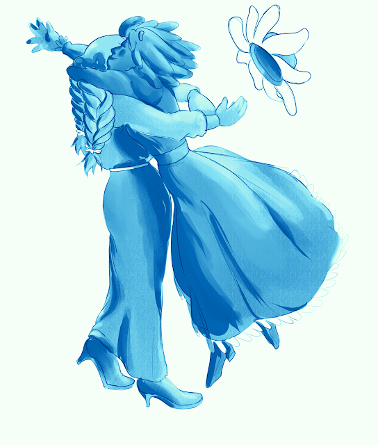
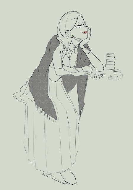
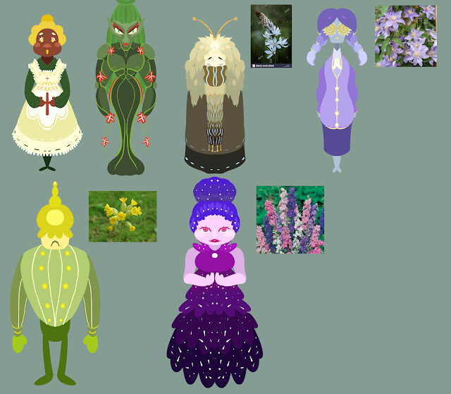
I've had some technical issues in the past week. My tablet pen broke so I needed to get a new one. Also, I was struggling a bit with what I should do next but I got an idea once my new pen came in. Basically, what I've done is drawn a couple of my flower characters in poses with a particular emotion expressed. I then used gradient maps to change the colour palette to see how colour effects how the emotion is read. Pose 1: Clover and chamomile (Happiness/Joy) Pose 2: Asphodel (Sadness/Remorse) My main take away from this experiment is that colour does little to effect the emotion of the image in of itself. Firstly, there's things like saturation and brightness. For example, red is typically associated with intense emotions but I can adjust how intense it feels though saturation levels. Also, I need to take into account context of the image. Colours are strongly symbolic of certain emotions but what symbolism you want is largely based on co...


